Reviewing your most (and least) efficient deliveries is easy in the Generac Operations Portal.
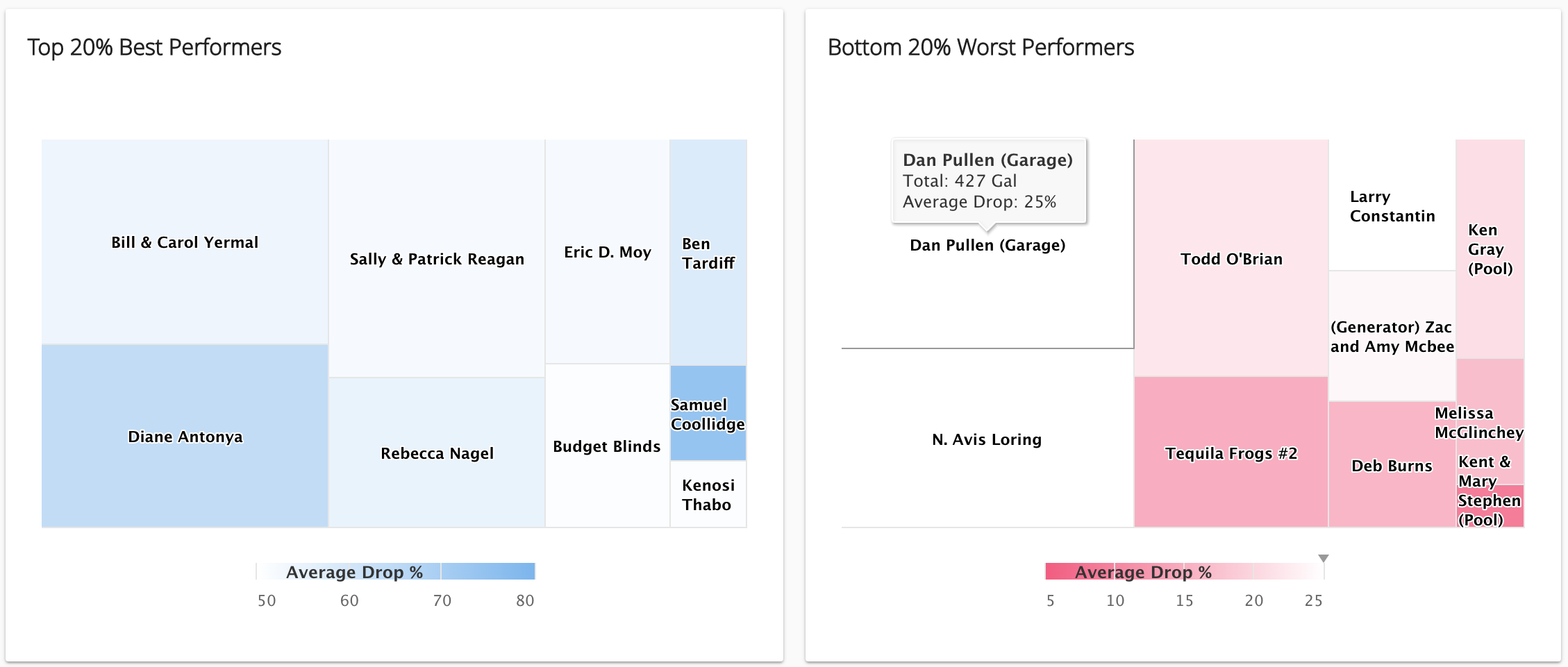
Simply click on the Deliveries menu after logging in to the Operation Portal. Scroll down on the page and you’ll see two heat maps. The blue heat map on the right shows the top 20% of your customers with the most efficient deliveries. The red heat map on the left shows the bottom 20% of your customers with the least efficient deliveries.

Understanding the Top and Bottom Heat Maps
You’ll see different size squares in each heat map – the size represents how many gallons were delivered to that customer. The larger the square, the bigger the customer (by gallons).
You’ll also see color shading in the heat maps. This represents the average delivery size as the percent of the that customers tank. The darker blue, the bigger the drop as a percent of the tank. Conversely, the darker the red, the smaller (and worse) the drop size is.
So who are your most (and least) efficient customers to deliver?
A customer with a large, dark blue square would be a sizeable customer that is not being over-serviced, where you have a good delivery schedule. On the other hand, if you see a large, dark red square, you are probably going far too often to that customer to deliver and only getting small drops. You should definitely review your routing and delivery scheduling for that customer to see if you can make improvements.
 Shop
Shop